We’re releasing the biggest visual change to Canny since we launched.
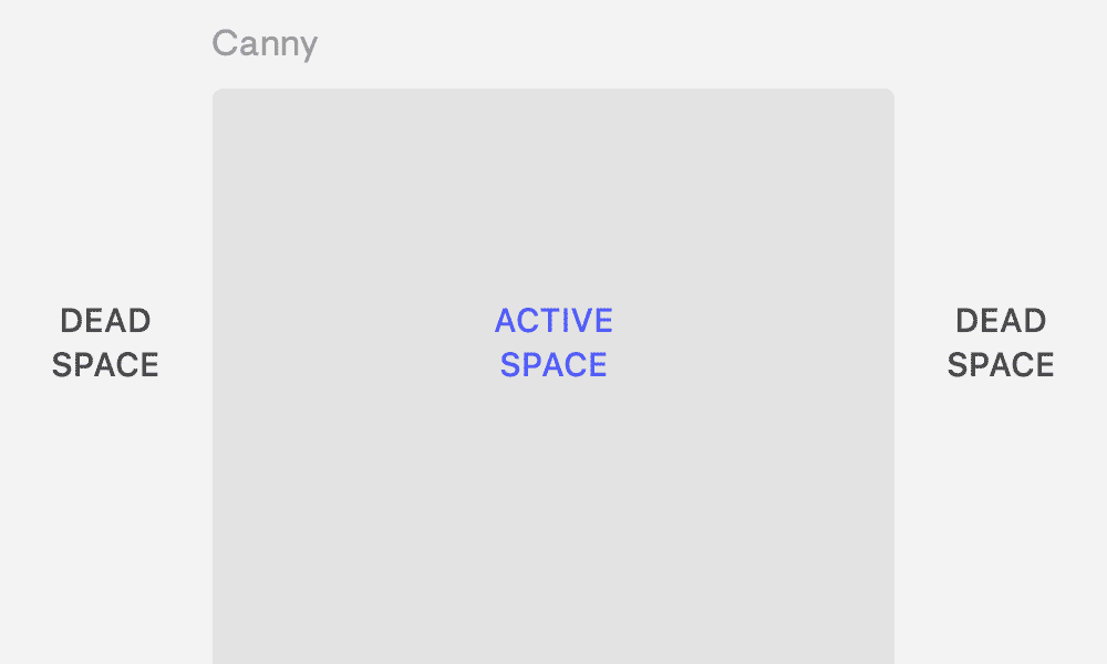
Essentially what we did is moved from a restricted-width layout to a full-width layout.
I know that doesn’t sound like much, but it’s been an intimidating product update change to make.
To be clear, this only affects the Canny admin view. Public, end-user views remain unchanged.
From day one, our customers have expressed how much they like Canny for its simplicity and ease of use. With 2.0, we’re trading some simplicity for power.
Having more screen real estate means our customers can see more and do more. We want to pack more power into Canny and the old layout was constricting.
That said, balancing simplicity and power will always be important to us. That’s why we’ve made incremental changes and we’ve been testing 2.0 for about 8 months.
How we slow-released Canny 2.0
I worked at Facebook where the smallest change could confuse and frustrate millions of users. I knew we’d want to make sure existing customers had plenty of time to get familiar with 2.0.
So, we rolled out 2.0 in phases:
1. Explicit opt-in for the 2.0 beta
We added a button in the account dropdown to opt-in to 2.0.

Some people found the button and tried 2.0. About a month after, we emailed people letting them know about the beta.
This was the longest phase, lasting about 6 months. We got a lot of feedback and implemented improvements. People always had the option to go back to 1.0.
2. Auto opt-in for new customers
New customers wouldn’t be exposed to 1.0. We wanted to make sure newly onboarded users had a good experience with 2.0.
3. Forced opt-in for existing customers
At this point, we were quite happy with 2.0. We switched people who had never tried 2.0 or had opted-out previously into the beta.

Everyone still had the option to switch back to 1.0—under 10% did.
4. Deprecating 1.0
1.0 served us well but it’s time for Canny’s next phase. We’re closing the chapter on 1.0 so we can fully focus on the new Canny.
What actually changed
I wanted to highlight some significant changes that come with Canny 2.0.
Feedback view
We merged the post list view with the posts themselves. It’s now represented more like an inbox where you can easily switch between posts.

Post views are the most active in Canny so we wanted to make navigating around zippier.
With this change, we were also able to include:
- Searching across all boards
- Exporting all posts based on select filters
- Filtering posts by date range
- Saved and sticky filters
Voters modal
We moved the voters list from a separate page to a lightweight modal.

The voters modal supports:
- Showing the MRR impact of a feature
- Segmenting voters
Users
Similar to the feedback view, we merged the user list with their profile pages. You can easily select the user you want and view their feedback on the same page.

We also merged in searching for companies/accounts. Searching and selecting a company will show feedback across all the users in that company.
Changelog
Previously, you had to toggle back and forth between markdown and the public preview while drafting changelog entries. Now, you can see the preview as you draft.

Mobile
The 1.0 mobile view was not usable. The 2.0 mobile view is!
Feedback and accepting tradeoffs
As I mentioned, during our 2.0 beta phase, we got a bunch of feedback.
A lot of it was negative. Most often, we heard that people were overwhelmed by how much information was on screen.

To combat this negative feedback, we:
- Added the ability to collapse a sidebar
- Adjusted the layout to introduce more white space
- Muted features that could be less prominent
More functionality often means more complexity. We accepted some tradeoffs and did our best to simplify. Overall, we’re trying to make using Canny easier.
We know we’re not going to please everyone—especially people who were used to 1.0. But, these kinds of changes take time to get comfortable with.
Over time, we also got a bunch of positive feedback:

It’s never easy to make big changes to a product, but we wanted to make decisions that would help Canny continue to grow as a product going forward.
We took it slowly—making sure to roll out in phases and listen to users. From there, we iterated based on that feedback. It was important for us to give our existing customers input in the new Canny they’d be using.
Canny 2.0 also sets us up for some exciting things we have planned this year. We can’t wait to share them with you!