Hi, I’m Sarah Hum – co-founder of Canny. I juggle roles as a product designer, product manager, and entrepreneur. It’s a wild ride, and I love it.
Design is more than just the “looks.” It’s a key player in a startup’s success. It shapes how users feel and interact with your product. It can set you apart in a sea of options. That’s where a design founder comes into play.
We created Canny to be easy to use and user-focused. Our design-first approach wasn’t just for show – it guided every choice we made. It helped us win users’ hearts, turning quick visits into lasting relationships.
If you’re curious about building a design-first SaaS, keep reading. I’ll share some design principles we live by that helped us get to where we are today.
Canny’s journey and the role of design
Before starting Canny, I worked on the design team for Facebook Messenger. When we started Canny, I knew I wanted to build a product centered around design.
Since building and designing Canny, we’ve received positive feedback, especially around our design.
“It just works. The UX/UI is simple, people have no questions about using it. It’s the kind of product that I really love.”
Aurélien Georget, CPO at Strapi
My focus on design extended beyond just our product. Other high-level areas I always pay special attention to include
- Landing pages (they create the first impression)
- Pricing page
- Product onboarding
Focusing on design might be tough if you don’t have a background in product design. I still believe a few simple design guidelines can go a long way. It’s all about the mindset.
Pre-design: setting the stage
It’s tempting to start working on your big idea right away, but hold on! There’s groundwork we can’t skip.
1. Know your target audience
Understanding your audience is key.
- Who are they?
- What do they need?
- What do they love?
Dive deep into who benefits most from your product. Explore their lives, wants, and dislikes. The more you know, the better you can serve them.
2. Explore different paths
Each problem often has multiple solutions. It’s tempting to go for one of them. Try to top yourself and think:
- Is the issue just a symptom of something bigger?
- Is there a smarter, simpler fix?
You might not need to do any design work in the end.
3. The power of ‘no’
Here’s a hard truth: you can’t do it all. Trying to please everyone pleases no one. You’ve got to pick your battles.
Choose the ideas that pack the most punch. Sometimes, this means turning down suggestions, even good ones. How? Show your work. Use data to explain why one feature wins over another. It’s not personal; it’s strategic.
Check out this fun video we put together about saying “no” to feature requests.
5. Balance it out
Remember: good design is a balancing act. It’s not just about how things look, but how they work. It’s the harmony between form and function, UI and UX. Keep this in mind, and you’re off to a great start.
Now that you have this foundation, let’s dive into some common design principles.
UI meets UX
Design is a dialogue. UI and UX are our key speakers. They might seem similar, but they play different roles in one crucial conversation: the user’s journey.
UI, or user interface, is all about what meets the eye. It’s the buttons you click, the paths you follow, and the visual cues that guide you. UI design needs to be clear and tell users what’s up at a glance.
UX, or user experience, is the big picture. It’s how all the parts come together to make you feel. Is it easy? Is it enjoyable? Does it make sense? UX controls all that.
When UI and UX work in harmony, they create something special: a user-holistic experience. It’s not just about a nice facade or a single fun feature. It’s about a seamless journey from start to finish.
There’s a concept called “dribbblisation of design.” Typically, “things that look great but don’t work well” fall under this category. Great design aims to fix that and help people actually use the product.
Reaching goals
Users don’t like hurdles. They want to reach their goals with no fuss. That’s why we aim to cut the clutter and keep things smooth. That means removing bumps in the road and making sure each step feels natural.
Simplicity
Ever heard of “drunk user testing“? It’s a cheeky way of saying your design should be so simple that anyone could get it, even after a few too many. It’s a funny idea, but it’s got a point. Simple is sticky. It’s what keeps users coming back.
In the end, great design crafts a journey that feels good every step of the way.
At Canny, our goal is to build a product that is a joy to use. We aim to bring users to their “aha moment” as quickly as possible, with minimal distractions. In other words, we try to make it super simple to use. Our customers seem to resonate with our design approach.
“I love the design and single sign-on solution. I also love the fact that Canny is hosted on our domain. And it’s simple. It just works. There’s no headache. It’s just easy to set up, and it saves time.”
Philippe Lehoux, founder at Missive
Design thinking: beyond the surface
When we dive into the world of design, we’re not just playing with aesthetics. We’re engaging in “design thinking” – a creative, strategic approach that starts with understanding people. It’s a philosophy that doesn’t just seek to decorate but to dive deep, explore, and solve real-world problems in intuitive ways. And this mindset is the heartbeat of everything we do at Canny.
Design as a problem-solver
This approach isn’t about impulsive fixes. It’s about useful solutions. It means stepping into the user’s shoes, feeling their pain points, and using these insights to guide our creativity. It’s not about guesswork; it’s about empathy, understanding, and smart, user-centered decision-making.
Intuition is key
An intuitive tool doesn’t just happen. It’s a result of deep understanding and anticipation of user needs. If you do it right, you can predict their needs before they voice their concerns.
It’s design thinking in action — creating experiences that feel natural, almost like the product is reading your mind.
In essence, design thinking takes us beyond superficial beauty. It’s about crafting solutions that resonate on a deeper level.
Here’s how we applied these principles at Canny.
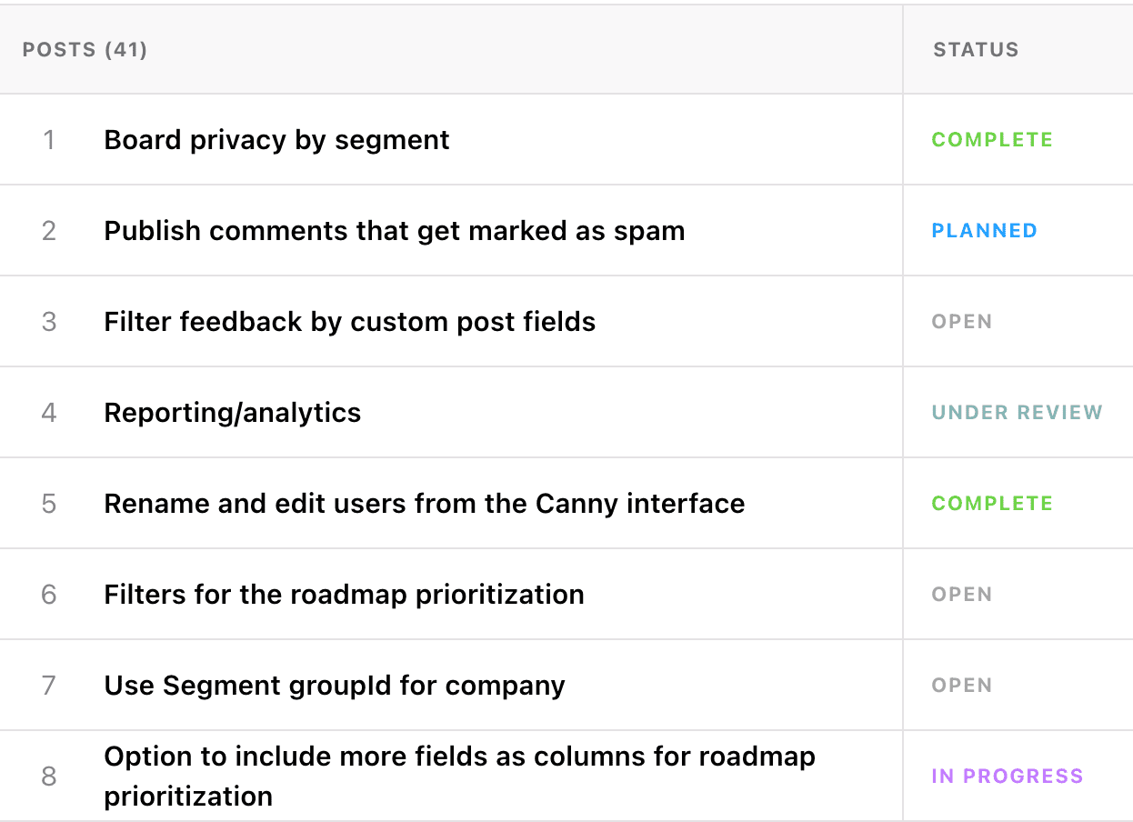
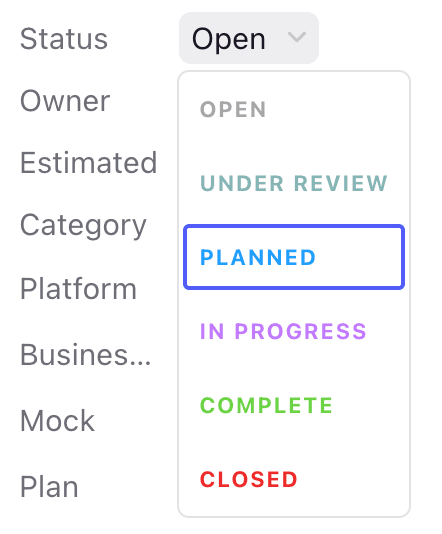
At first, we had a set of default statuses. The options were enough for most customers. Plus, the experience remained simple.


Years later we added custom statuses. This design process involved:
- Building a status management feature for admins
- Checking how statuses appear in different views
- Updating integrations that involved using statuses
Also, we now need to consider custom statuses for future features we build. It is very easy for complexity to snowball.
In the beginning, we limited our scope to the essentials. It was the right move. From there, we collected feedback to understand how the custom status feature needs to behave.
How can you apply this strategy?
When you’re building your next feature:
- Strategy: think about your target persona. What goal are they trying to reach? What’s the most optimal/most obvious route to that goal?
- Engineering: consider building things that allow you to easily expand functionality later.
Remember: adding functionality later is much easier than stripping things down.
Now that we’ve covered some common design principles, let’s talk about applying them.
Embarking on the design journey requires a compass, and that’s where solid design principles come into play. It’s not about wandering aimlessly in the creative woods; it’s about navigating with purpose, guided by user research, simplicity, and strategic thinking.
1. Tuning in to user feedback
Listening is an art, especially when it comes to user feedback. It’s not just about collecting opinions; it’s about diving deep into what clients are saying and what they’re not.
Surveys, interviews, and direct questions are your best friends here. They’re the compass needles pointing to the true North of user needs.
2. MVP: The art of essentialism
In the world of product design, MVP (Minimum Viable Product) isn’t about being minimal; it’s about being essential. It’s asking, “What’s the core value we’re delivering?” and stripping away anything that doesn’t scream “yes!”. It’s about avoiding the allure of complexity and embracing the elegance of simplicity.
3. The Pareto Principle: the 80/20 rule
Ever heard of solving 80% of problems with just 20% of effort? That’s the Pareto Principle, and it’s gold. It’s about identifying the most impactful elements of your design and really, truly honing in on them. It’s not about cutting corners; it’s about maximizing positive impact through smart, strategic choices.
Good design is invisible. It’s the silent guide that leads users where they need to go, effortlessly. It’s about sticking to what’s familiar, reducing friction, and making the journey intuitive. Your website isn’t a treasure map; users shouldn’t need clues to navigate.
5. Removing friction
Friction? That’s just a fancy word for “user annoyance,” and it’s a big no-no. Whether it’s a cluttered checkout page or a confusing sign-up form, any hiccup can turn a user’s experience sour.
The goal? Smooth out those bumps. Make the experience so seamless that users glide through without a second thought.
6. Being prescriptive
Choices are great, but too many can lead to decision paralysis. Sometimes, it’s best to guide users down the clearest, simplest path. It’s not about taking control; it’s about enhancing clarity and reducing confusion. Especially in the early days, speed and simplicity win the race.
In essence, navigating design principles isn’t about following a map, It’s about creating the map as you understand the terrain better. It’s a dynamic, responsive process that puts user experience at the heart of every decision. And remember – the journey matters just as much as the destination.
Let’s break this down further.
Simplifying user choices
Every choice is a crossroad, and too many can lead a user astray. That’s why we trim the extras and keep only what serves our journey’s purpose. It’s about presenting options not as a buffet but as a carefully curated menu, handpicked for the user’s delight.
Guiding users with intention
Our designs aren’t just layouts; they’re signposts. Each element is a subtle guide, a nudge in the right direction. We don’t leave a user alone in the dark. We illuminate their path, making the journey not just easy, but also enjoyable.
Focused simplicity
In the battle between simplicity and options, simplicity reigns supreme. Why? Because your brain is a precious resource. We don’t want to overwhelm it; we want to cater to it. Our designs don’t shout; they whisper, providing just the right amount of information at just the right time.
Prioritizing common actions
Not all actions are created equal. We prioritize based on user needs, bringing the most common actions to the forefront. The rest? They’re there, but they don’t crowd the space. They’re like backstage crew, out of sight, but ready when needed.
Ever felt the thrill of a seamless sign-up or the ease of a hassle-free checkout? That’s prescriptive design at work.
We lay out features so naturally that users find them before they even realize they’re looking.
Prescriptive design isn’t a set of rules; it’s a philosophy. It’s clarity in the midst of chaos, a beacon for users swamped in a sea of choices. It’s how we turn overwhelming possibilities into focused, delightful experiences. Because in the end, design is not about the creator; it’s about the user – the traveler.
Collaborative design: the path to wholeness
Design isn’t a solitary journey; it’s a collaborative expedition. It thrives on diverse perspectives, thrumming in the space between creativity and practicality. Here’s how collaboration shapes our path at Canny.
1. Embracing feedback and collaboration
Great ideas aren’t born in a vacuum; they’re nurtured through collaboration. We listen — to our team, to our users, to everyone willing to share a piece of their mind. Feedback isn’t criticism; it’s the soil where our ideas grow. It challenges us, pushes us, and molds us into better creators.
Listening to feedback helps us create a community out of our users. When we engage in conversations with them, we start to understand their needs and pain points better.
2. Creativity meets pragmatism
Creativity is the heart of design, but pragmatism is its compass. One pushes the boundaries; the other sets them. It’s a delicate dance, a give-and-take where wild ideas are tempered by real-world constraints. And in this balance we find our truest, most impactful expressions.
3. Cultivating continuous improvement
Design is never finished. It’s an evolving entity, a story that unfolds with each user interaction. We’re not just builders; we’re gardeners, tending to our creations, pruning here, nurturing there. We embrace change, celebrate adaptation, and strive for improvement.
The advantage of a design-driven co-founder
What is it like – to be a designer and a co-founder? It’s like having a secret sauce for your startup. Our design journey with Canny isn’t just about making things look snazzy. It’s about constantly getting into our users’ shoes, really feeling what they feel, and letting that shape everything we build.
This approach turned complexity on its head. We choose clear, simple, and sanity-saving options that our clients can’t get enough of.
And the collaboration? Gold. Nothing beats the buzz of bouncing ideas around and making something better than you’d imagined.
Remember: your knack for design isn’t just a cool skill; it’s your startup’s ace. It’s about creating experiences, forming real connections, and steering your business in a direction that feels right. Own that superpower, and watch it propel your startup to the stars.
If you’re a founder, but not a designer, I hope you can use these tips and principles and build a better product.


