There are many benefits to having a public roadmap. However, finding good public product roadmap examples can be hard.
Public roadmaps need to be formatted, designed, and hosted in a way that makes them easy to consume. They’re useless without proper presentation.
This means that building a public roadmap can be a daunting task.
If you’re a Canny user, you know that we offer public product roadmap software, too.
However, if you’re not a Canny user (maybe you should be?), you’re probably wondering about other options out there.
In this post, we’re going to look at three companies who solved their roadmap needs without a specialized tool, and did it well!
We’ll also show you how to manage a product roadmap using Canny (featuring our own roadmap!).
We’ll look at why they’re good, and what to learn from them.
Specialized roadmapping tools
These tools tend to be the best at communicating product goals. We’ll show you how they do it through examples.
Public product roadmap example 1: Vendasta
Vendasta’s platform is made up of interconnected tools that help you sell more. They connect small businesses with product and service vendors.
“We offer the technology, tools, training, support, frameworks, and partnership that enable marketing agencies and other digital experts to sell, go to market, and make money with Vendasta. You can make money by reselling our white-label products and services or selling in our marketplace.”
Brendan King, CEO at Vendasta
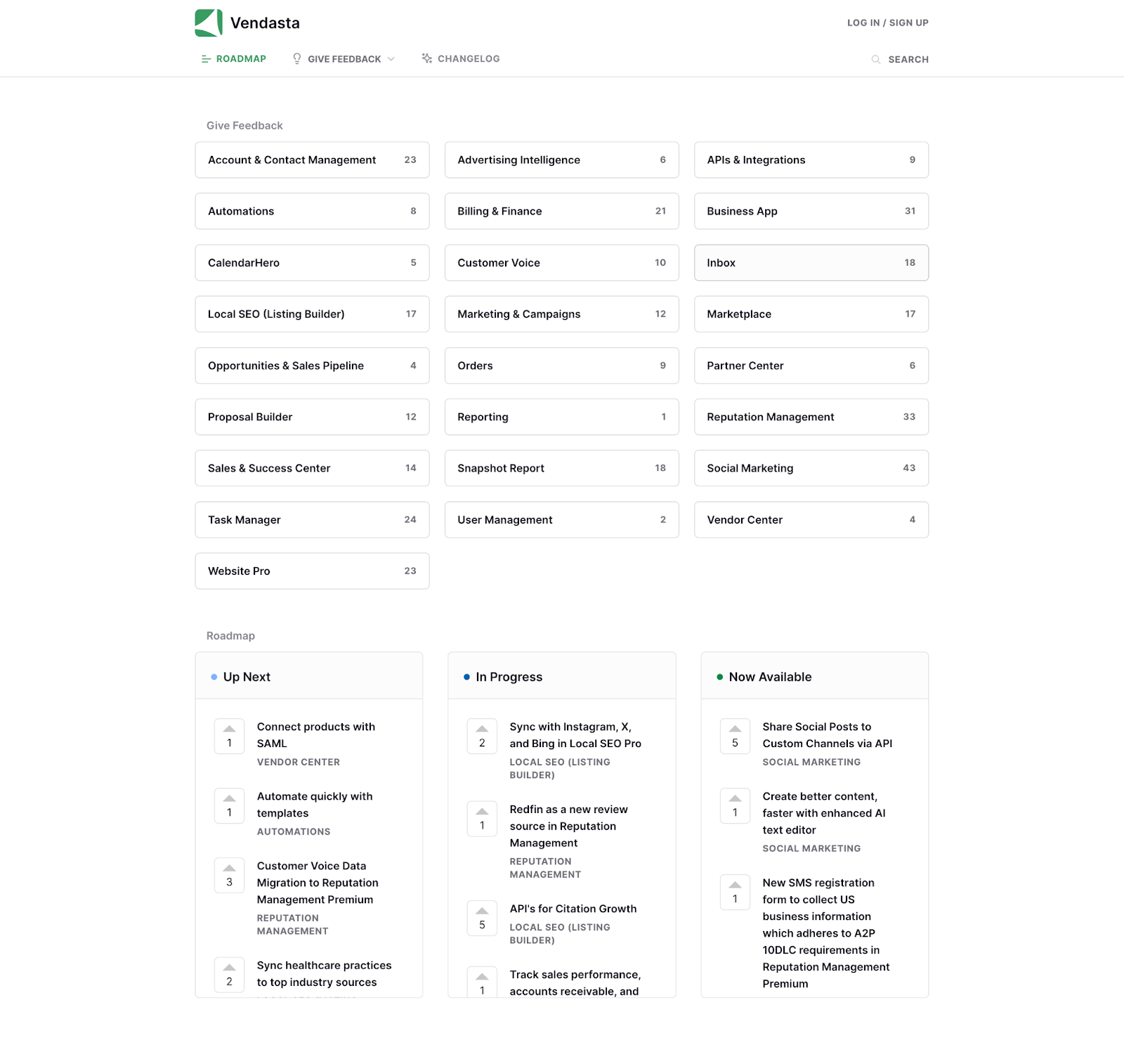
Vendasta uses Canny for their public roadmap and changelog. They have quite a few categories on their feedback board. Once they prioritize that feedback, they divide it by status:
- Up next
- In progress
- Now available
Vendasta’s using Canny very actively, keeping all users up to date on their progress. Their internal teams can clearly see which categories receive the most requests. They can take that data into consideration when choosing the next focus area.
Also, users can click into each feature request and find more details. For example, they can find out who requested it and, add their votes and comments. They can also see any existing comments from users or Vendasta’s team.
Here’s an example of a discussion between users and Vendasta’s team regarding one feature request.
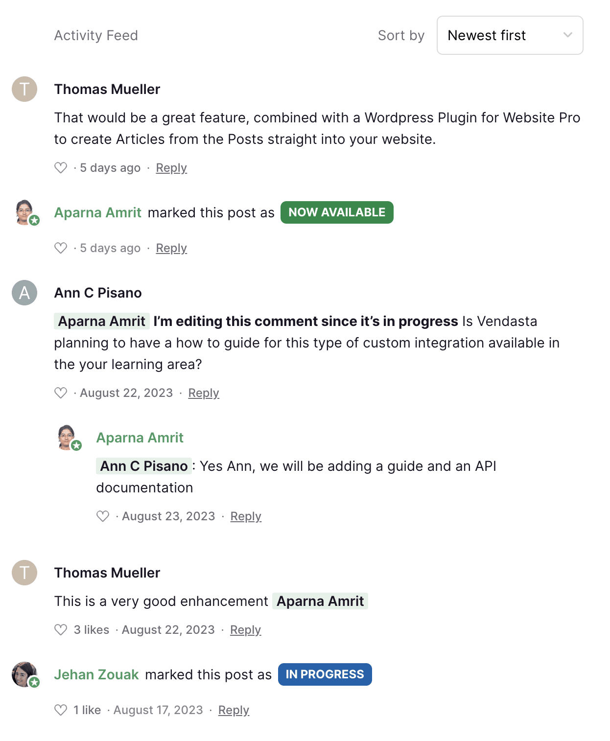
What’s particularly great about this roadmap is automatic notifications. As soon as the status of a specific feature request changes, everyone who interacted with it gets notified automatically. This is by far the easiest way to close the feedback loop.
Product Roadmap Example 2: Canny
We don’t like to toot our own horn too much, but we think our product roadmap is pretty good too!
One of the best aspects of our roadmap is that it’s integrated with our product management system. It’s part of a system that includes:
- Feedback and idea management
- Prioritization
- Product roadmapping
- Changelog and release note updates
We involve our key stakeholders throughout the entire process. And, we can update our roadmap with just a few clicks.
What does that actually look like?
We start with feedback and idea management on our public boards:
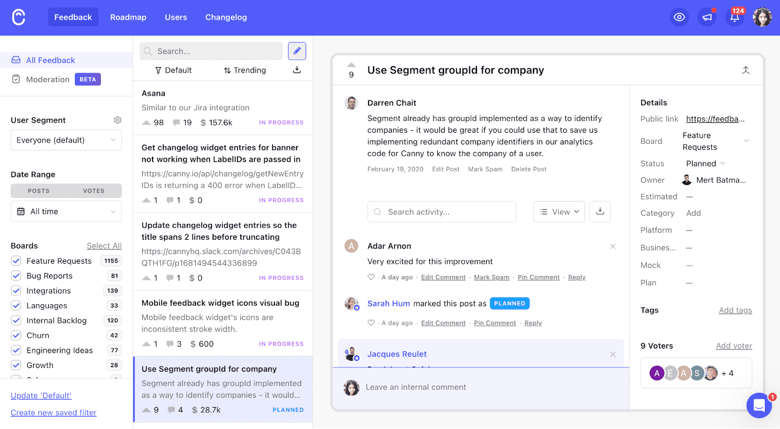
This lets our internal team and each product owner see a list of all product feature requests and ideas we’ve collected. We can also see how many votes each new feature has and some other values we pulled in.
The flip side of this is that our key stakeholders can also see all the ideas we’re considering and add their input. This goes a step further than managing a public roadmap — external stakeholders can actually help decide what makes it to our roadmap with their input.
From there, we score each idea using our weighted scoring prioritization formula. We then pick the highest-scoring ideas and move them into our public roadmap for all our users to see.
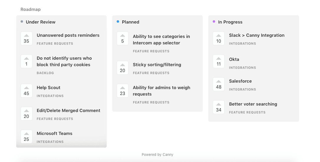
We have three statuses for our roadmap:
- Under review – our product team is considering the idea/feature request.
- Planned – we’ve added this feature to our current product development cycle and the feature is coming. The product manager working on the feature posts an update that alerts each stakeholder interested in the idea. We ask for further input and feedback to finalize the project.
- In progress – our development team is working on the feature.
One of the main draws of this setup is that it encourages collaboration between our internal team and external stakeholders. We can learn more about how our users would use different product features. They can tell us why some features we’re considering are important to them (or aren’t). It helps our product roadmapping to be more user-driven, which helps us build the most impactful features.
The final step in our external roadmap process is publishing a changelog entry.
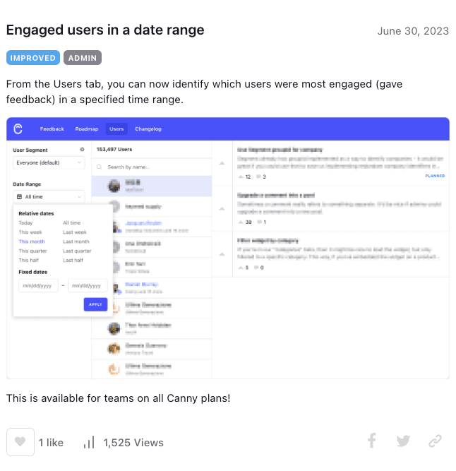
With each product release, we create detailed release notes using our changelog tool. This provides details on the new feature and how to use it. We can also share the entry with everyone who voted and commented on the original feature request.
We like to call that closing the feedback loop. It’s the last stage in what we like to call a feedback-driven product roadmap.
Adapted tools
These tools weren’t built to host product roadmaps. However, they can still communicate product goals and the product development process. Some of them even offer a product roadmap template. Let’s look at some examples.
Public product roadmap example 3: SocialBee
SocialBee is an AI-powered social media management tool. It allows you to effortlessly generate captivating captions and images. It also empowers its users to share content across multiple social networks.
SocialBee uses Trello for their roadmap. Here’s what it looks like.
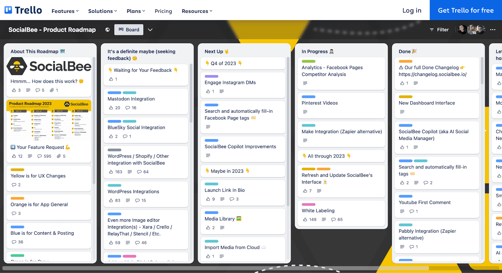
While it isn’t a specialized product roadmapping tool, it works well enough for basic organization.
Here’s what we liked about SocialBee’s solution.
Simplicity
Trello boards can get incredibly messy. Endless columns, statuses, tags, and posts make a roadmap hard to navigate and slow to load.
Regardless of Trello’s capabilities, SocialBee’s product managers made their roadmap system incredibly simple. 5 statuses total, and that’s it.
Anyone browsing it can easily find what they’re looking for without having to scroll for hours.
The roadmap “key”
SocialBee had added an explanation and a “key” to the roadmap in the very first column.
The key explained the color tags used in the roadmap layout and made finding relevant information easier by filtering.
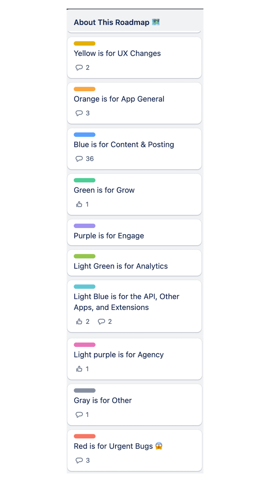
Even though the roadmap is pretty straightforward, there is also an explanation in the “how does this board work?” card.
This eliminates any potential confusion with which status really means what, or what stage something is in.
Option to send feature requests
Brownie points go to the “Your feature request” card in the first column.
Many people get inspired to submit their own ideas when looking at public roadmaps. If the option to do so isn’t in easy reach, it means extra effort for the user. The extra effort often means they’ll give up.
Trello isn’t the best place to integrate feedback forms or pop-ups into. SocialBee has solved this by adding this card with their email. They also encourage users to leave comments on the card.
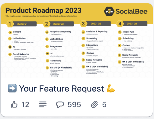
If you’re planning on using Trello for your roadmapping, it’s definitely a strategy to consider.
Votes and comments
The thing we love most about a good product roadmap example is the ability to have a discussion about features. Hey, it’s pretty much what we built Canny for.
SocialBee isn’t using Trello to just inform their users about new features. They’ve enabled comments and votes on cards, and they actually engage with users in these sections.
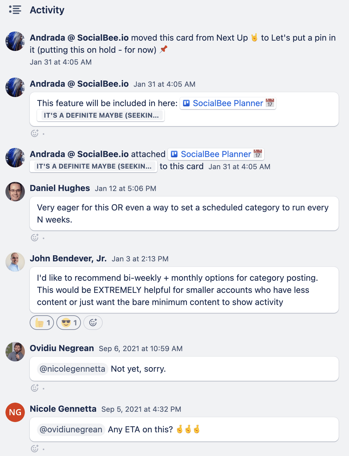
You can start out by just having your roadmap viewable in general. However, for maximum input and extra context, we suggest that you create a place for discussion, regardless of the tool you use.
All in all, SocialBee took a tool that is not specifically designed for roadmapping and made it into a suitable solution.
If you’re thinking of using Trello for your roadmap, take notice of SocialBee when it comes to simplicity, communication, and organization.
Custom-built tools
Tools like these are designed in-house to communicate the product vision and help product managers align. Since they also feature public roadmaps, users can get a sneak peek into the product strategy. Let’s explore these roadmap tools too.
Public product roadmap example 4: Atlassian
Atlassian is a software company that develops products for software developers and project managers. You might’ve heard of their popular tools like Jira, Confluence, Bitbucket, and Trello. They help teams become more nimble, creative, and aligned.
Atlassian is one of the few companies out there that have built their own custom-made roadmaps. What’s more, they have a separate feature roadmap for two areas of the business: Cloud and Data Center.
Building a custom public roadmap can seem like a scary task and a lot of work. Atlassian has made their solution simple yet effective.
Here’s what we liked about it.
Simplicity
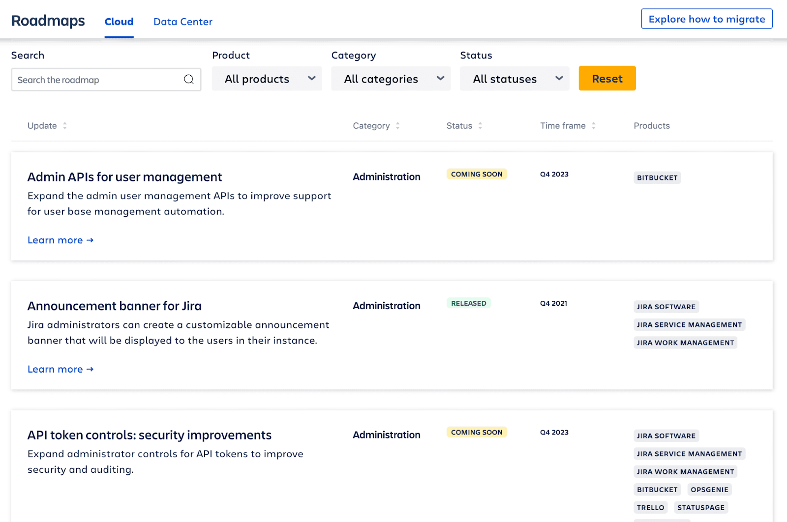
Unlike some roadmaps, this one is easy to look at. Atlassian’s design includes lots of white space and color codes for statuses. This helps to clearly communicate the product strategy
Customizability
You can quickly find exactly what you’re looking for in this roadmap. There are lots of ways to filter your view:
- Search
- Product
- Category
- Status
- Time frame
Engagement
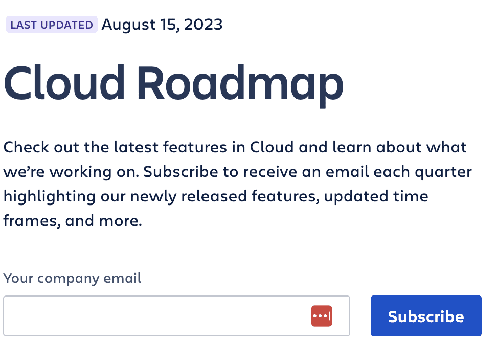
At the very top of the page you can subscribe to Atlassian’s newsletter to stay in the loop. We’re all about engaging with users, and this is one of the ways you can do that.
If you click on any roadmap item, you can also copy the link to share this update.
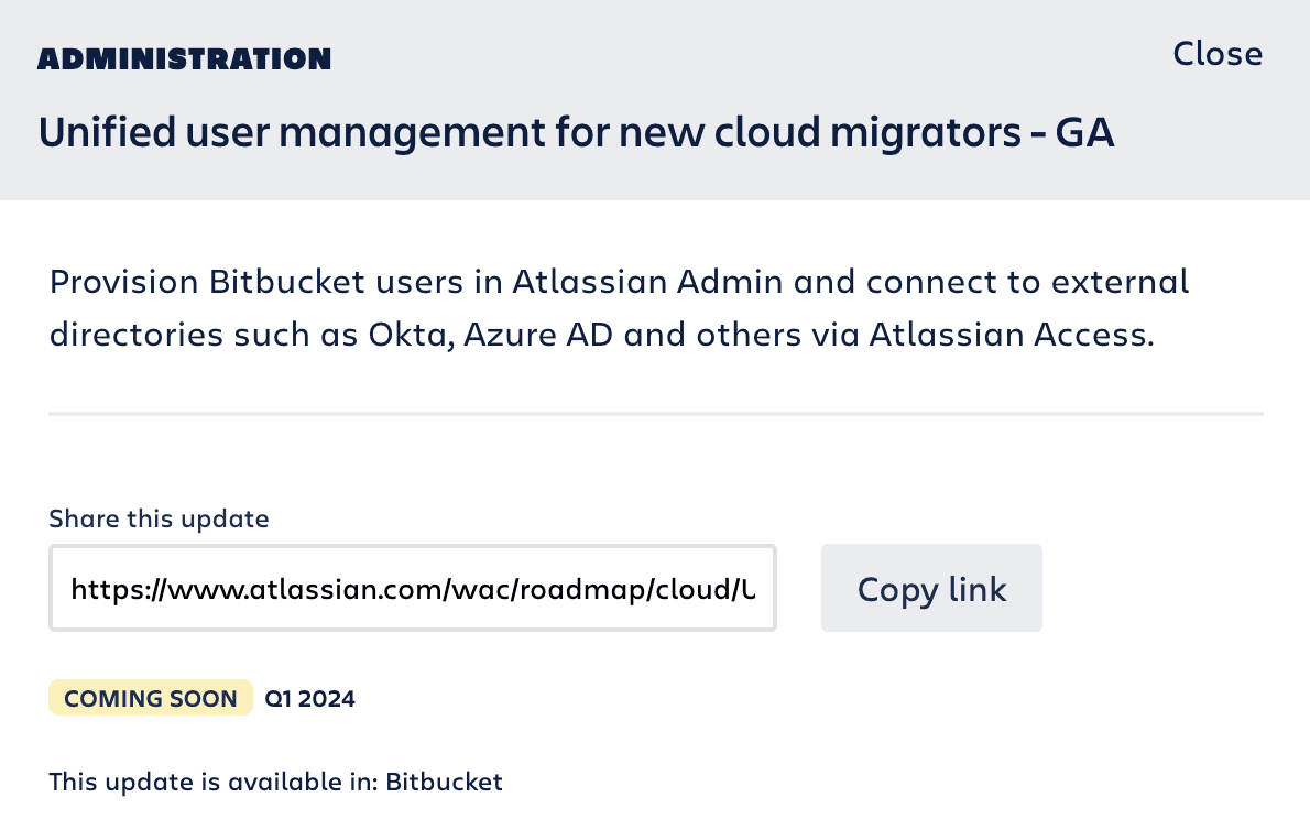
On that note, Atlassian’s roadmap doesn’t include any comments, likes, votes, or any ability for users to share their opinions. We believe that adding these features would enhance this roadmap and the user experience.
Public product roadmap example 5: Microsoft
Microsoft is a tech giant that you’ve definitely heard about. They build world-famous hardware and software. So naturally, they built their own roadmap as well.
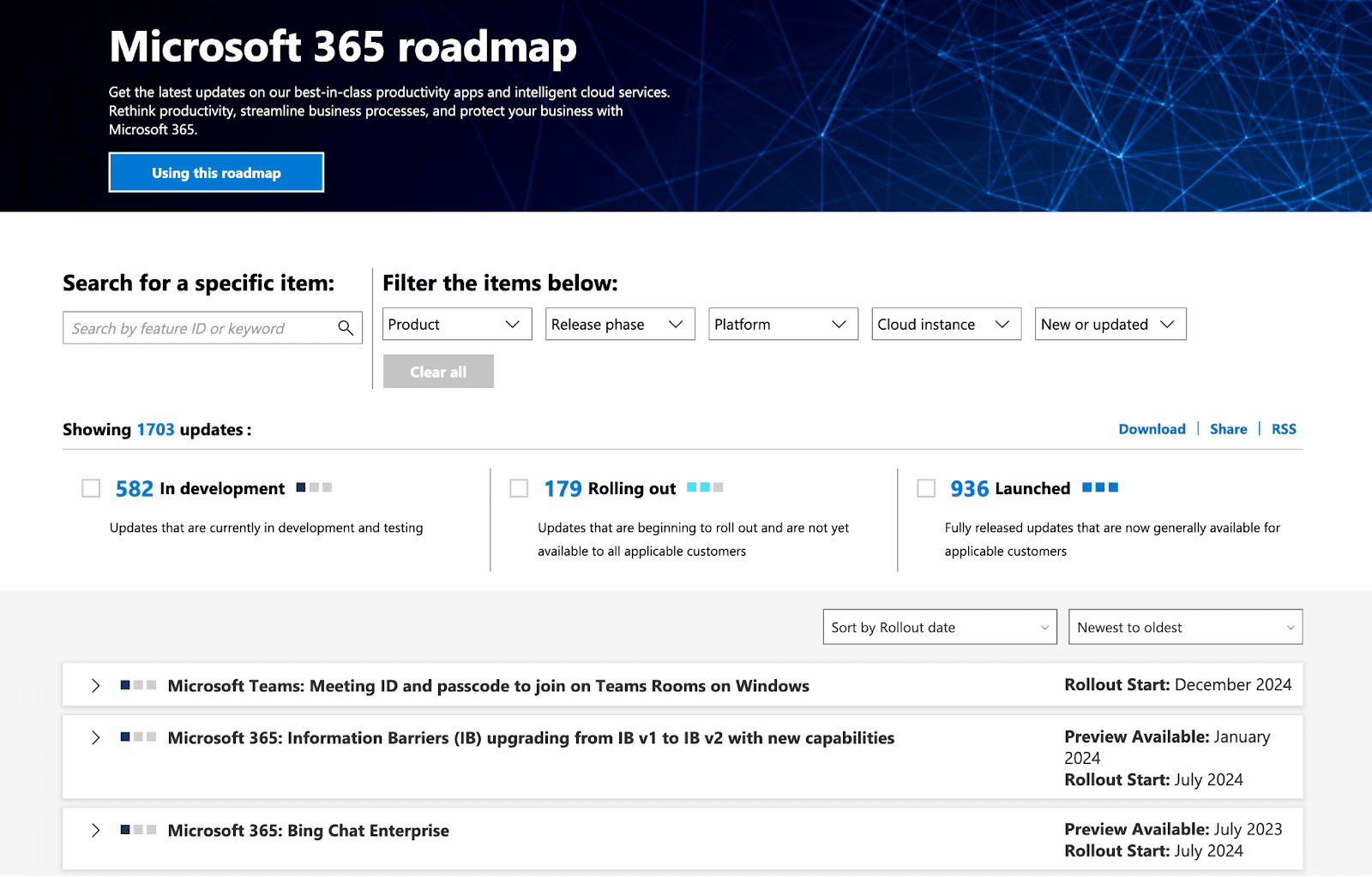
Microsoft has a lot in the works, and they’re not afraid to share their process. We respect that!
Here’s what stood out to us about this roadmap.
Guidance
At the very top, you can click on “Using this roadmap” and get directed to a PDF guide. It walks you through this roadmap and helps you navigate it.
It explains how to filter, sort, search, and even provide feedback!
Customizability
Similar to Atlassian’s example, there are lots of ways to customize this roadmap. Especially because there are lots of entries, it’s important to let users only focus on what they care about.
Microsoft’s roadmap allows you to filter by:
- Product
- Release date
- Platform
- Cloud instance
- New or updated
You can also sort by date and search for specific items.
Details
If you want to really dive deep, each roadmap item expands and gives you lots of info.

This can be even more useful for internal teams at Microsoft. In such a large organization, you might not be aware of every feature being built. This roadmap sheds light on all of them.
One missing thing is an opportunity to engage. Just like Atlassian, Microsoft’s roadmap doesn’t allow users to comment, like, vote, or engage in any way.
When you’re such a large company, managing all engagement can get extremely complicated. That’s where dedicated roadmapping tools can help.
Public product roadmap example 6: GitHub
GitHub is a go-to tool for developers. Software engineers can store and manage their code and collaborate using GitHub.
It makes sense that GitHub built their own roadmap.
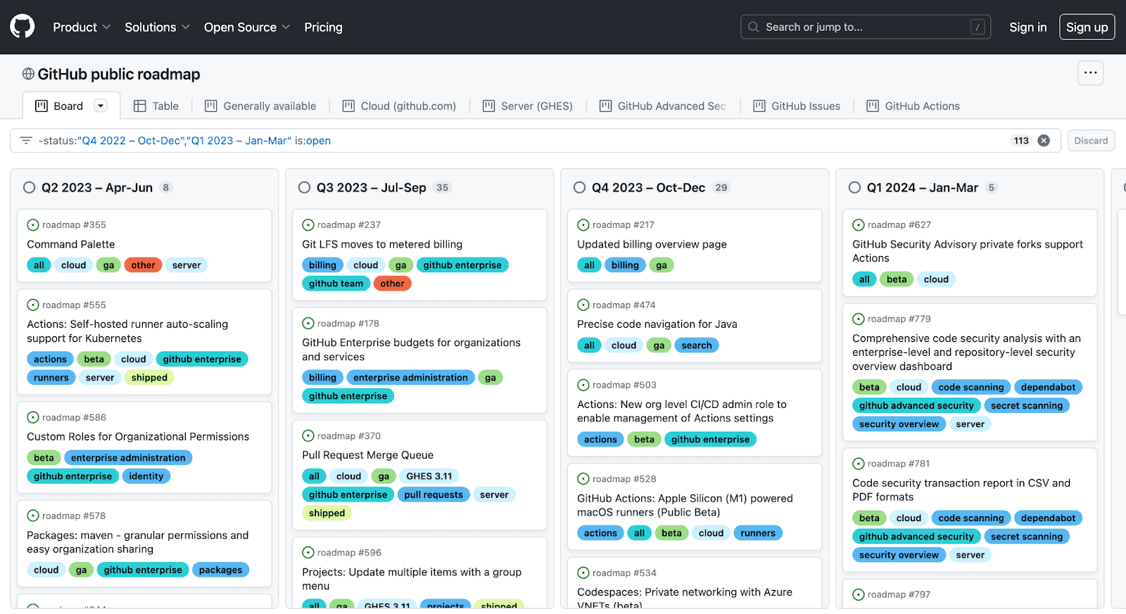
Here’s what we like about it.
Simplicity
GitHub is a complex tool. So communicating the product vision can get tricky.
GitHub’s doing a good job with this timeline roadmap. They separate their projects by quarters and add color-coded tags to each item. Their roadmap resembles Trello’s Kanban-style setup.
Details
Despite being simple, there are lots of details in this roadmap. At the top, there are many tabs you can click on to customize your view.
Clicking on each item shows more details as well.
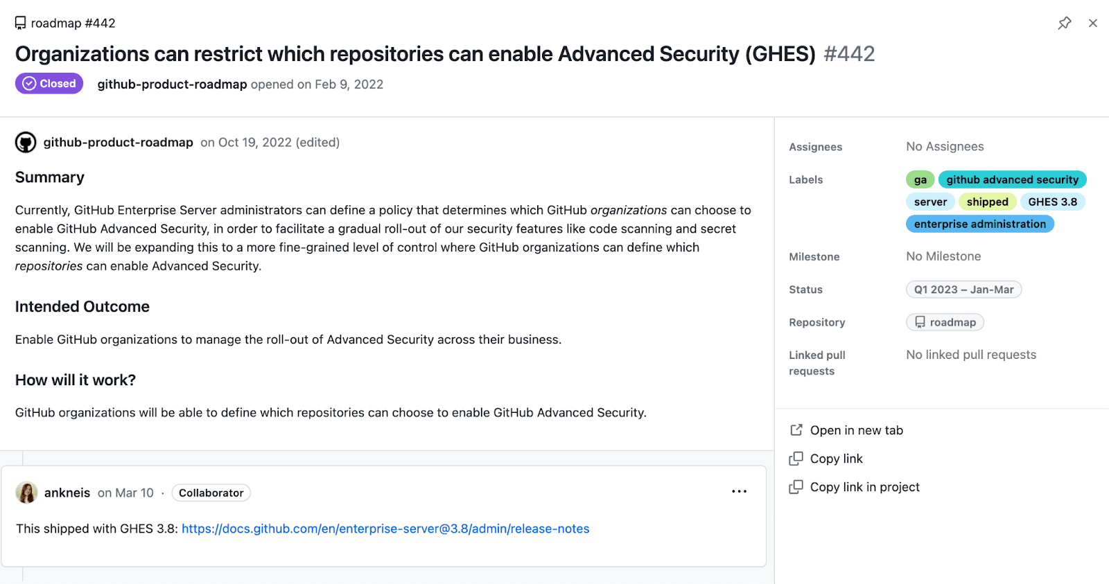
Once again, there’s no way to engage with this roadmap, and that’s the only drawback. If users could comment, upvote, and suggest ideas, this roadmap would be even better.
Public product roadmap example 7: Up
Get ready: this roadmap looks like nothing you’ve seen before. Or at least it’s not your typical roadmap.
Up is a digital bank that helps you organize your money. They’re very focused on design – it’s evident from their website. And their custom-built roadmap is no exception.
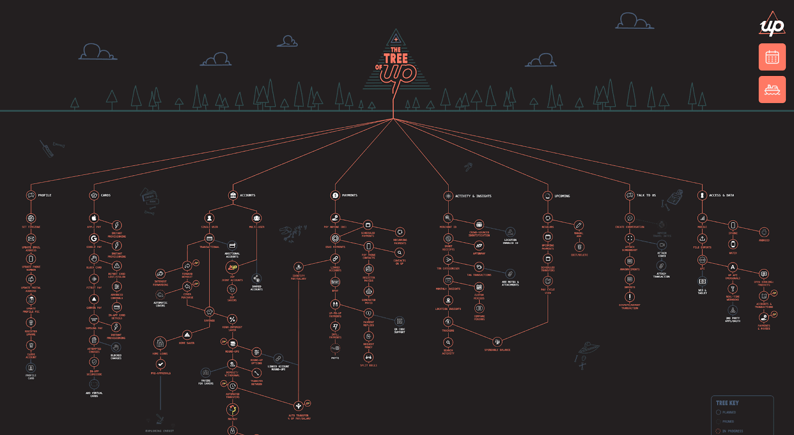
Some might find this design a bit jarring. That’s why, when you first visit this roadmap page, a pop-up appears to walk you through it. And yes, this custom roadmap even has a custom name – The Tree of Up.
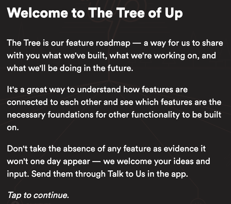
Here’s what’s great about this roadmap.
Design
Design is subjective. It’s hard to argue that this design stands out. It lures you in and encourages you to explore. The purpose of this roadmap is to show you how features are connected to each other. The hierarchical view illustrates the software development process well.
The roadmap “key”
If you look closely, you’ll find the “tree key” in the bottom right corner.
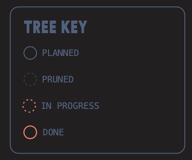
This key explains that the outline of each item indicates its status.
Up’s roadmap is definitely visually interesting. Some customization and engagement features would help make it a bit better though.
Go for simplicity, UX, and communication
Regardless of whether you use Canny, Trello, or a custom solution for your public roadmap, there are some principles to keep in mind:
- Keep it simple: overwhelming roadmaps are… well, overwhelming. Avoid adding too much detail and information in one place. If you think extra resources are needed, make them findable, but separate.
- Think about user experience: roadmaps should be easy to navigate, understand, and filter. Information is more important than design, but that doesn’t mean your roadmap should be hard to use.
- Allow communication both ways: it’s fine to start out with just making your roadmap public. However, adding a communication point, whether it’s comments, a forum, or a form, will allow you to get better context and feedback for your roadmap items.
Wanna see some more amazing product roadmap examples? Check out this guide to the best public roadmaps!
Did we miss out on any product roadmap examples? Let us know!


