We talk a lot about product prioritization. That’s because we’ve seen how big of a difference it can make in building successful products. Choosing the right thing to build next can really be the deciding factor between making it or failing.
Especially when the economy is unstable, prioritizing the most impactful projects is key. Optimizing resources really comes down to feature prioritization as well.
But what exactly is product feature prioritization and how do you approach it? We’re breaking it down in this blog post – keep reading!
What is product prioritization?
Product prioritization is the process of deciding which features to develop first. Usually, a product manager assesses the potential impact on the user and the business when prioritizing.
They consider factors such as:
- Customer need
- Market demand
- Technical feasibility
- Resource constraints
- Potential benefits versus the costs
The goal is to determine the most valuable and achievable features to build. Essentially, it’s deciding what to work on first to ensure the most significant benefits.
We recently held a webinar around resource optimization and prioritization. Product experts from Salesforce, Google and Mastercard joined us to talk about it. Check out the recording.
Why product prioritization matters
When you don’t prioritize, you essentially rely on your intuition. You might think that you know your product and your customers best. You may also have a very specific product vision. And you might be getting ideas from lots of different sources.
Ultimately, it doesn’t matter where you get your ideas. What’s important is prioritizing (aka picking the best) ideas. In other words, you need to have an objective way of determining which features are the most important.
Here are a few reasons to prioritize:
- It helps your product team focus on developing the most valuable and impactful features from the product backlog
- It saves time and resources by avoiding wasted effort on low-value features
- It can help ensure that user needs are met, leading to higher customer satisfaction and retention
- You can stay competitive by delivering features that meet market demand
- You can prioritize features that generate the most revenue or cost savings
All in all, there’s no reason not to prioritize. But how exactly do you do that? Well, there are many different ways. And we’re going to break down the most popular and effective ones.
Models/frameworks
Most product managers rely on a specific framework to prioritize. These systems essentially help you make sense of the mess that idea management could become. Without a working system, it’s easy to get overwhelmed, miss important requests, and lose alignment with the team.
When you adopt one, or a few, of these prioritization methods, you can see the value of each idea. This, in turn, helps you plan and prioritize your overall roadmap.
Want an easier way to prioritize a roadmap? Give our roadmap prioritization software a try.
Let’s go over some prioritization frameworks and models to help you prioritize product features.
Keep in mind your overarching product strategy when selecting a model. You’ll likely find that certain models fit better with your workflow.
Note: we put together this guide with the best frameworks and examples. Get it for free here!
RICE
Intercom introduced the RICE model, which is now one of the most popular ones. It uses four main factors to rate any project or idea:
- Reach – how many stakeholders will this affect?
- Impact – how important is this feature to your customers? (low, medium, or high)
- Confidence – how sure are you that your reach and impact estimates are correct? (%)
- Effort – how many people need to be involved? How many days, weeks, or months will this take?
After you’ve estimated all of these numbers, you can calculate the score using this formula.
RICE = (Reach x Impact x Confidence) / Effort
Example
Let’s walk through an example.
Reach: How many users will this feature affect?
Score: 6 (the feature will affect a significant portion of your user base, but not everyone)
Impact: How much will this feature affect the key metric you’re trying to improve?
Score: 9 (the feature has the potential to significantly increase revenue)
Confidence: How confident are you in your estimates of reach and impact?
Score: 7 (you’re fairly confident in your estimates, but there’s still some uncertainty)
Effort: How much effort will it take to build this feature?
Score: 4 (the feature is fairly complex and will require a significant amount of development time)
To calculate the RICE score for this feature, you simply multiply the scores for each factor together:
RICE score = 6 * 9 * 7 / 4 = 94.5
Based on this RICE score, you might decide to prioritize this feature over others with lower scores. However, you would also want to take into account other factors, such as strategic alignment and resource availability, before making a final decision.
Remember: you can determine what each of these factors means to you.
For example, “reach” can be the number of new customers you expect to get after shipping a new feature. Or maybe it’s the number of new leads that will come.
Same with effort – some choose to focus on the hours it’ll take. Others focus on how many people need to be involved. And some combine these two to get a “person-months” number. Choose what makes the most sense to you.
Pros: Bird’s eye view. This framework helps you see the product from different perspectives.
Cons: Time – this framework is time-consuming. It’s also not 100% accurate since it relies on estimates.
Best suited for: established products. You need existing data to make future projections with this model.
ICE metric
If you liked the previous framework, but want something a bit simpler, ICE might be the model for you.
This scoring method ranks the impact, confidence, and ease of building a particular feature.
ICE score = impact * confidence * ease
Pros: quick and simple
Cons: subjective
Best suited for: time-sensitive projects, picking a winner out of a few already shortlisted options
Example
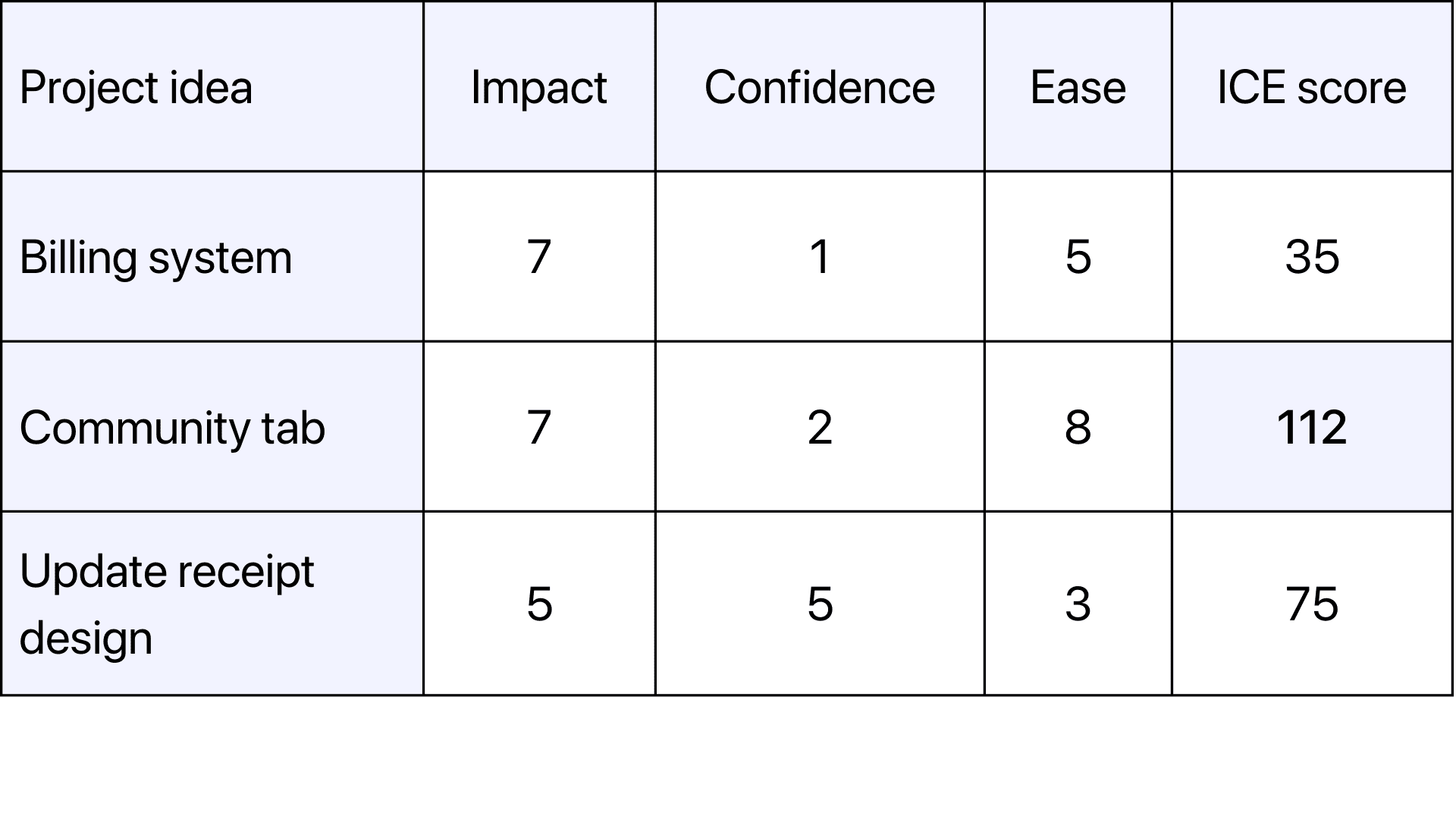
Imagine you’re considering three ideas:
- Billing system improvements
- Adding a community tab
- Updating receipt design
Here’s how you could use ICE to score these ideas.
Community tab is the clear winner here.
Impact–Effort matrix
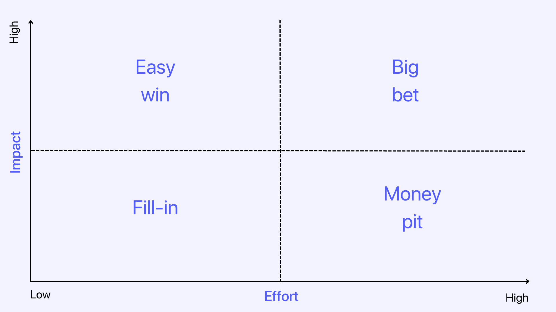
Aka effort-impact or a 2×2 matrix. It’s also sometimes called value vs. complexity/effort/impact matrix. It works particularly well for visual thinkers (marketers or designers for example). This matrix shows how the value (impact) of a feature relates to the complexity of development (effort). Here’s how it works.
- The product manager starts with a hypothesis and outlines all the required features
- Product teams that will work on this project (product, engineering, design, etc) vote on where to place each feature on the impact and effort dimensions
Every feature ends up in one of the four quadrants:
- Quick win – low effort and high impact
- Big bet – high effort and high impact
- Fill-in – low effort and low impact
- Money pit – high effort and low impact
Example
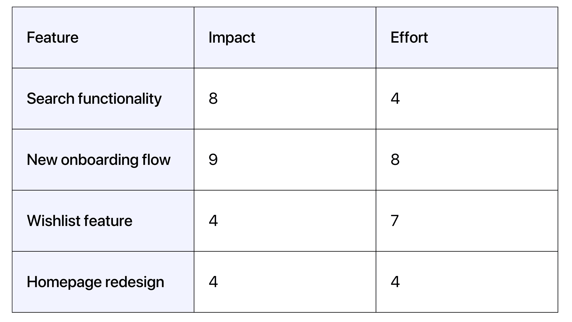
Let’s say you are a product manager for a mobile app. You have these four potential features to prioritize:
- Add search functionality
- Create a new onboarding flow
- Allows users to save items to a wishlist
- Redesign the homepage
Rate the impact and effort: For each feature, you need to rate the potential impact on your app’s success. You also have to rate the required effort. You can use a scale from 1 to 10. It’ll look like this:
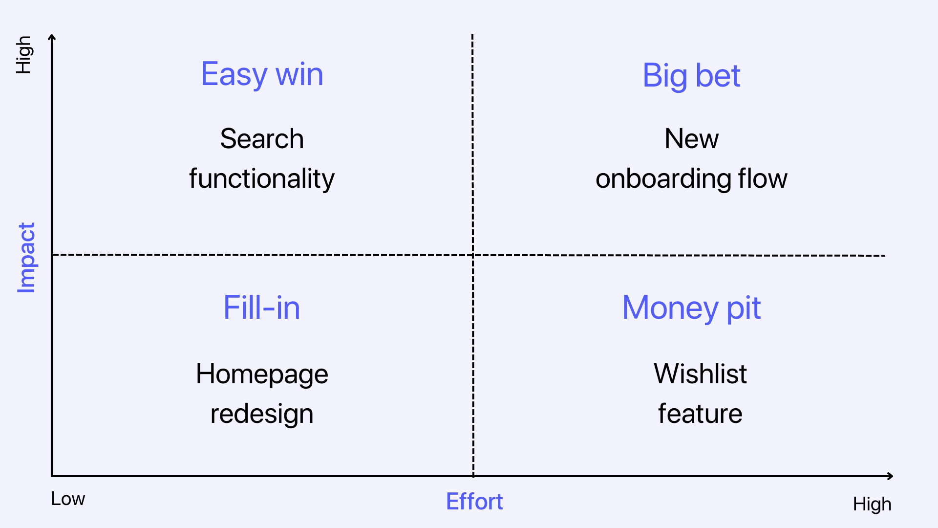
Then, to make it even more visual, you can create a 2×2 matrix like this.
Based on this matrix, you’ll prioritize search functions, followed by the new onboarding flow. And, thanks to this exercise, you can tell that a wishlist feature isn’t the best idea right now. Homepage redesign might be nice, but it’s not worth the effort right now either.
Pros: easy to use and understand. It’s visual and intuitive.
Cons: limiting with a high emphasis on impact. Not every good idea will have a high impact.
Best suited for: projects with only a few features. Otherwise, it can get pretty confusing.
When you have many features in each quadrant, you need to somehow score them further. For example, you can use the next prioritization method.
Feasibility, Desirability, and Viability (FDV) scorecard
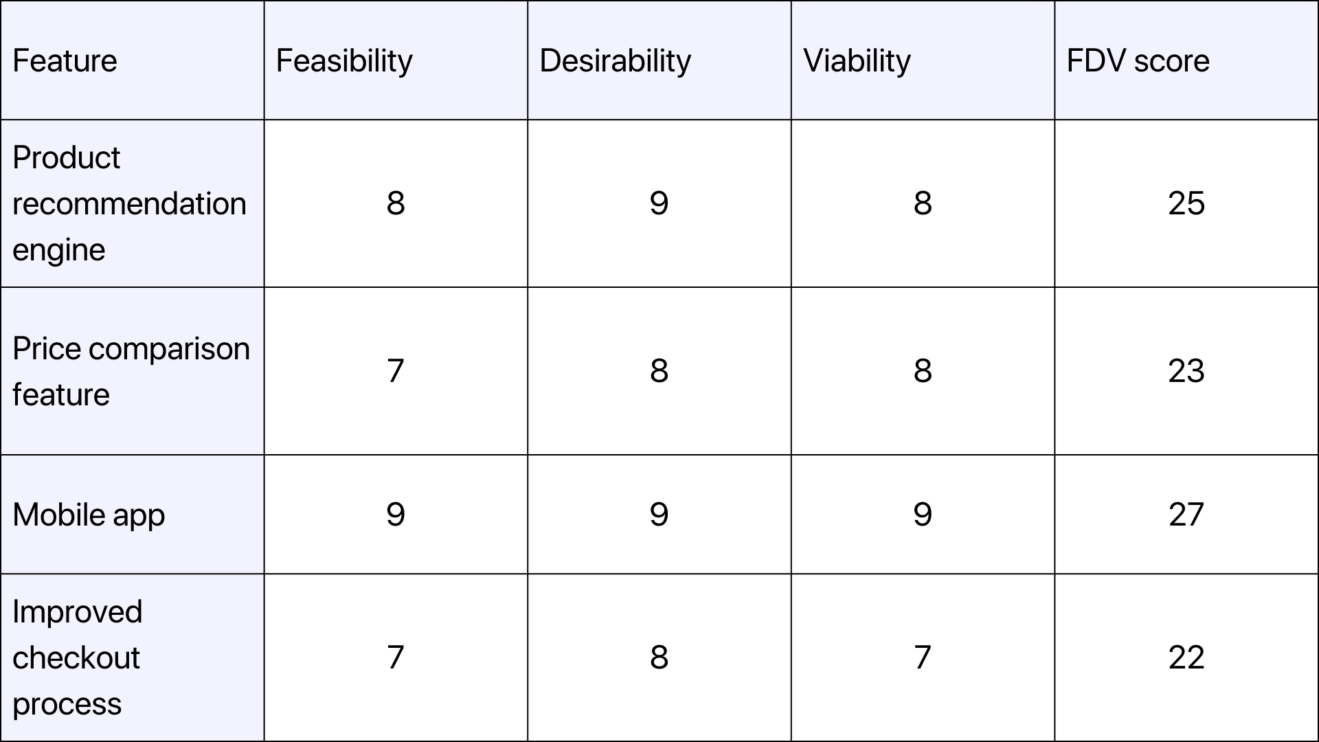
Using this method, you score each feature idea from 1 to 10 and try to assess whether it’s feasible, desirable, and viable. Here’s what it all means:
- Feasibility – do we have enough resources, skills, time, tools, storage, people, etc to build this?
- Desirability – do our users really want this feature? Does it solve their problem?
- Viability – will our users pay for the feature? Will it bring significant ROI?
To use this scorecard, create a simple spreadsheet or a table and assign a score to each potential feature. Then add them all together. Have an open discussion with everyone who’ll be involved in the development.
Example
Let’s walk through an example of four potential features that an ecommerce company might want to prioritize.
In this scenario, the mobile app wins.
Pros: puts customers in the center and considers potential risks.
Cons: relies heavily on qualitative data.
Best suited for: high-level discussions.
If you don’t have enough customer feedback, it might be challenging to accurately assess desirability and viability, though.
Weighted score
In this model, you give each feature a score based on two things: its importance, and how well it meets the needs of the user. Then you multiply the scores by the weight. This helps you rank the features in order of priority (higher scores = greater value to the customer).
Pros: Flexible, objective and comprehensive
Cons: Complex to set up; omits qualitative data
Best suited for: teams that have time and resources to set it up and adjust along the way
Example
What we love about this approach is that we can select our own criteria. Here’s how we made it work for us.
We took the factors that mattered the most to us and assigned a score to each of them (up to 100%). For example, we weigh more urgent items (priority) higher than design readiness.
That’s because urgent means it will no longer be relevant if we miss the window. Other projects may suffer, and we might need to reallocate resources to make this one happen fast. But, based on our calculations, it’ll be worth it in the end.
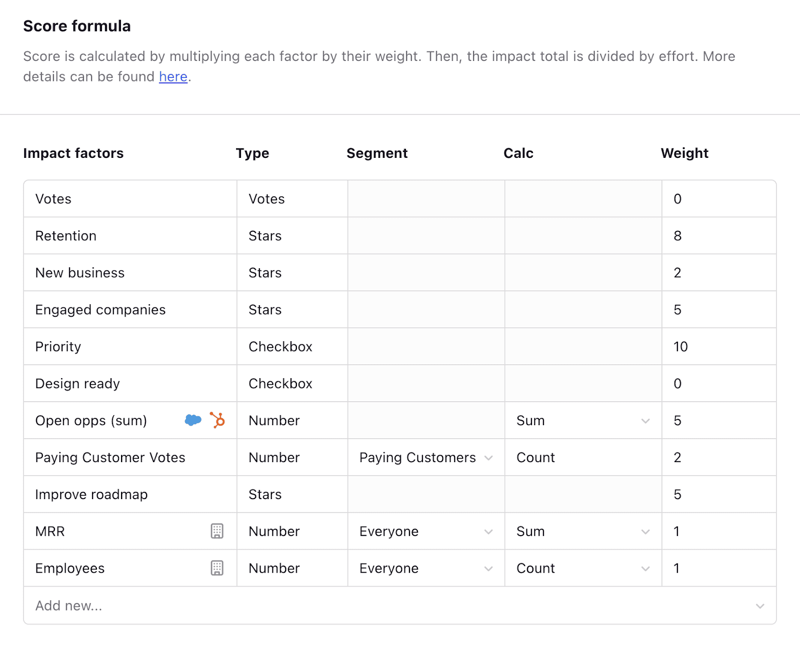
We add these factors to our prioritization formula in Canny. It then scores ideas for us and tells us what the biggest priority should be. From there, it’s easy to add the winning ideas to the product roadmap and get to work.
We feel like this particular system gives us and our clients a good idea of what matters most at any given time.
You can also adjust the criteria and the weight as you progress and your priorities change. Each team and project might have different criteria, and this method allows for that flexibility.
It could be difficult to assign weight to each impact factor, though. So discuss it with your team to get alignment from the very beginning.
Cost of delay
“Cost of delay is a way to communicate the impact of time on the outcomes the company wishes to achieve.”
Joshua Arnold, CPO at Apex Group
Cost of delay framework helps you assess the cost of not finishing a project or feature. Maybe you choose to postpone, but you’d like to understand what it will cost you. If so, this is the model for you.
Here’s the formula and how to use it:
- Estimate revenue per unit of time (how much additional revenue can you expect every month if you had that feature)
- Estimate the time it will take to develop that specific feature
- Divide the estimated revenue by the estimated time = cost of delay
Cost of delay = Estimated revenue / estimated time
Pros: focuses on money
Cons: subjective without accurate metrics
Best suited for: new product launches and other time-sensitive projects
Example
Your competitor releases a cool new feature and is luring in your clients. You need to react and build a similar feature or at least offer an alternative.
Your sales team also hears about this feature from prospects. You work together to estimate how much money you’re losing to competitors. At the same time, you can calculate how much additional MRR you could make if you had this feature.
Then you estimate that your engineering team would need about 5 weeks to develop a similar feature.
Finally, you divide the potential MRR by those 5 weeks and get your cost of delay.
Keep in mind: estimating monetary value is effective, but also subjective. Talk to your sales team and invite them into the conversation. They can help you understand the associated deal value.
Weighted shortest job first
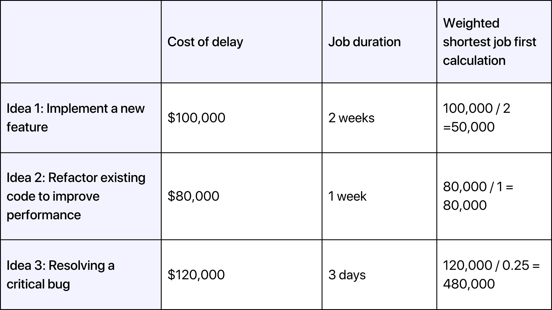
Weighted shortest job first is a part of the SAFe Lean-Agile framework. It uses the cost of delay from the previous section. With this framework, you’d divide the cost of delay by job duration. This framework is similar to value vs complexity, but is a bit more detailed. Here’s the formula.
WSJF = CoD/Job duration
Pros: Focused on ROI, consistent
Cons: Time-consuming to calculate
Best suited for: minimum marketable features
Example
Let’s illustrate with an example using three ideas.
Based on the calculated WSJF scores, you would prioritize the tasks in descending order of their scores:
Idea 3: WSJF = 480,000
Idea 2: WSJF = 80,000
Idea 1: WSJF = 50,000
MoSCoW method
This product prioritization framework is great because it’s also fairly simple. The idea is to use plain language and categorize all ideas into:
- Must have – features that make or break your product
- Should have – important but not vital features
- Could have – nice to have ideas
- Will not have – think back to the money pit examples from the Impact-effort matrix
Pros: flexible, collaborative, simple and quick
Cons: subjective, lacks big picture perspective
Best suited for: mature products
Example
Here’s how we would categorize our Canny features using this method.
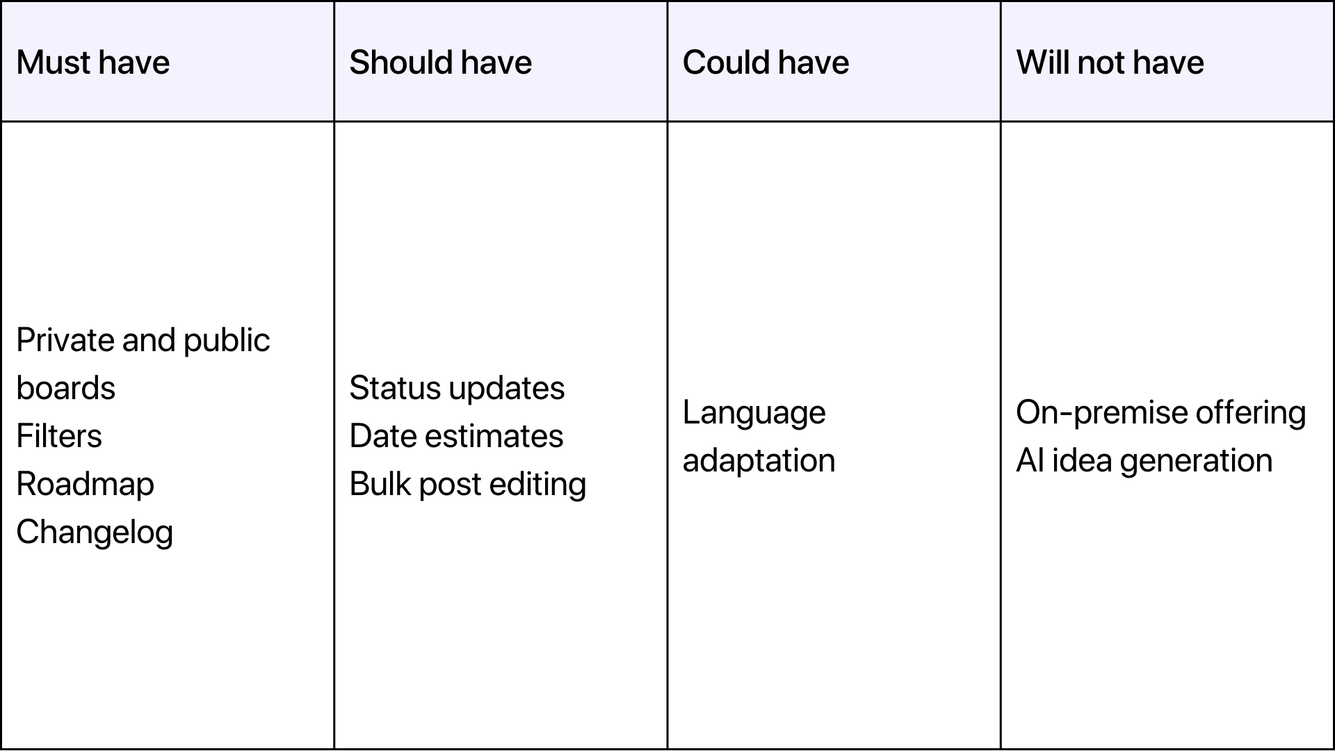
This analysis is especially useful if less technical team members are involved in a project. Be careful though: it’s easy to end up with too many must-have features.
Kano model
This model helps you figure out what features are most likely to satisfy customers. Then you weigh that against the investment to build the feature. It helps you determine which features are the most important to your customers. Knowing that you can truly build the right features that improve the customer experience.
Using the Kano model, you can group potential features into categories. For example, the categories could be:
- Delight customers
- Satisfy customers
- Disappoint customers
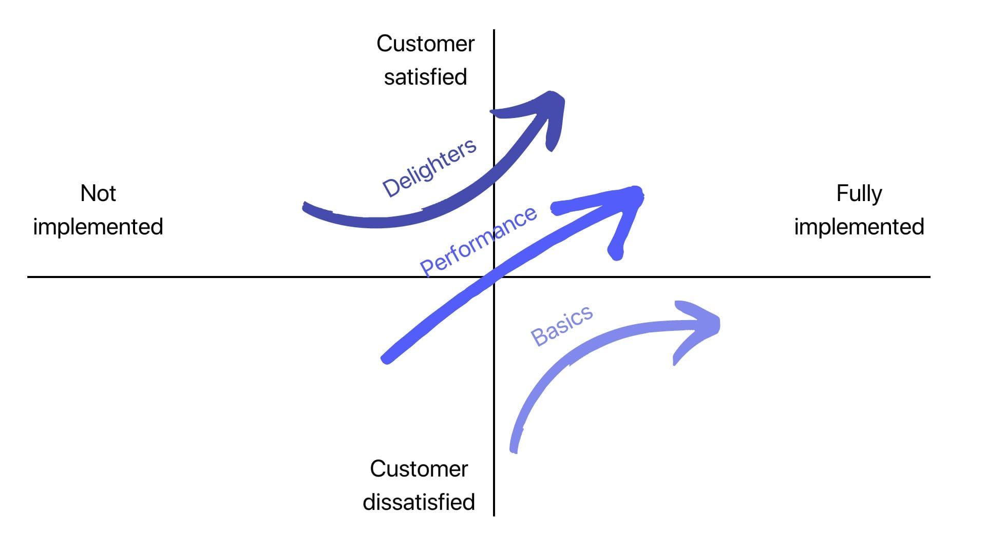
This model, unlike others, doesn’t have a specific formula. Instead, it utilizes a two-dimensional graph to plot customer satisfaction against the presence or absence of a particular feature. The results are then categorized into the five Kano categories: delighters, performance, basics, satisfied, and dissatisfied.
Pros: puts customers first
Cons: time-consuming and biased
Best suited for: startups striving to generate user feedback
Example
A product manager is working on a new feature: playlist recommendations in the music streaming app. Here’s how they’d use the Kano model.
- Interview customers about this potential feature
- Plot customer sentiment on a chart like the above
This way you can prioritize and focus on developing features that fall into the delighters and performance categories to maximize customer satisfaction.
Eisenhower matrix
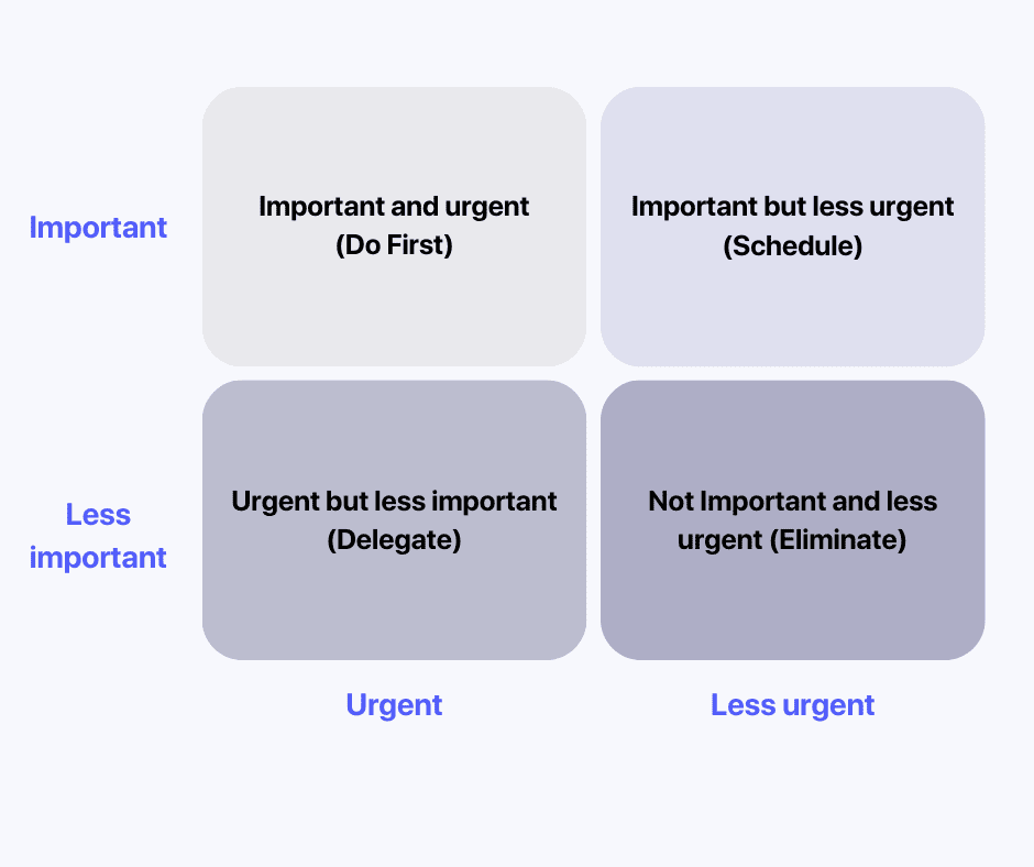
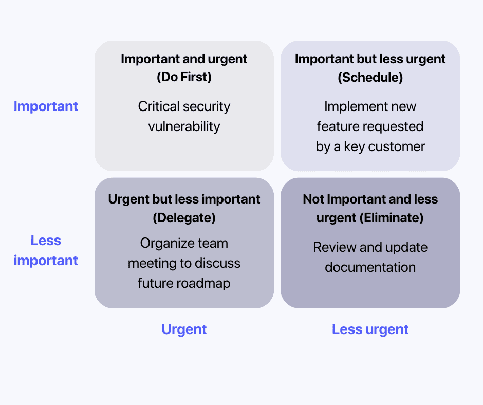
This matrix helps separate ideas based on their importance and urgency.
“I have two kinds of problems: the urgent and the important. The urgent are not important, and the important are never urgent”
Dwight D. Eisenhower, US President
You can visually plot ideas on a 4-section diagram.
The outcome of this exercise would be:
- High priority: very important and very urgent
- Medium priority: important but not urgent
- Medium priority: urgent but not important
- Low priority: not urgent and not important
Pros: plain, open, and business-targeted
Cons: lacks the technical aspect, a bit oversimplified
Best suited for: more stable environments
Example
Let’s illustrate with these four example tasks:
Idea 1: Fix critical security vulnerability
Idea 2: Implement new feature requested by a key customer
Idea 3: Review and update documentation
Idea 4: Organize team meeting to discuss future roadmap
Here’s how you’d plot them.
Walking skeleton
The walking skeleton method is common when developing MVPs. It helps to define which ones are absolutely critical for the product to work.
The walking skeleton represents a small implementation of the system with only a small end2end feature. It does not use the final architecture yet. At the point of production, it has the first connection with all the architectural components of the system. Later, the architecture and functionality evolve and grow together. This method is also the proof of concept.
Pros: fast prioritization and market validation
Cons: limited functionality
Best suited for: MVPs (minimum viable products)
Example
Here’s how you can use the walking skeleton method.
- Define product scope: get clear on the overall vision and goals of the product. Identify the core features and functionalities.
- Identify key user journeys: determine the critical user journeys that the product needs support. These are typically the most important paths that users would take to achieve their goals.
- Prioritize minimum functionality: prioritize the essential features and functionalities. Focus on building the absolute minimum set of features necessary to create a working product.
- Create the walking skeleton: create a functional end-to-end system that supports the core user journeys. It’s OK if it lacks additional features or polished interfaces.
- Gather and validate feedback: validate your skeleton with users, stakeholders, or early adopters. Gather feedback on the usability, performance, and overall experience of the core product. This feedback will help shape future development and prioritize additional features.
- Iterate and expand: Based on the feedback, iterate and expand upon the walking skeleton. Gradually add more features and functionalities. And don’t forget to address any technical challenges or usability issues you discovered during the initial implementation.
Story mapping
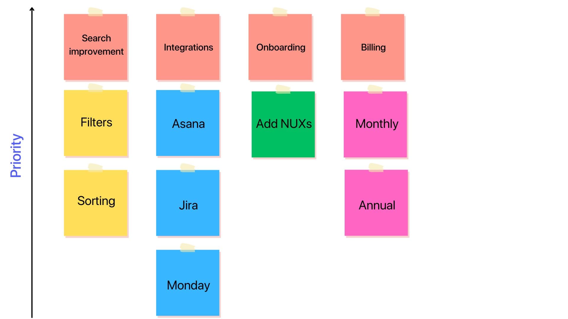
Story mapping technique starts with the product backlog and takes it to the next level. Through story mapping you can determine your next product iteration.
The product team maps out users’ interaction and usage of the product. They focus on the significant steps first, but also break them down into individual stories for each customer cluster. Here’s how:
- Horizontal axis: create a series of sequential categories that represent each stage of the user’s journey
- Vertical axis: prioritize these tasks from top to bottom
With the story map, you’ll get a visual and logical sequence of the user experience. This will help you determine which stories are a high priority.
Pros: you can quickly identify an MVP, collaborate with your team, and put your customers’ experience first
Cons: avoids external factors like complexity
Best suited for: MVPs
Example
Here are the detailed steps you’d take to create a story map:
- Define the user journey(s).
- Break it down into detailed steps and plot them on the horizontal axis.
- Add user stories and plot them on the vertical axis. When thinking of user stories, try to answer this question: what feature or functionality can support this step?
- Prioritize user stories. Consider factors like customer value, business goals, technical feasibility, and dependencies.
- Plot stories in order of priority: higher priority – top, lower priority – bottom.
- Get to work: focus on the high-priority user stories at the top of each column.
- Reiterate: keep adding to the story map, and reprioritize as needed.
Opportunity scoring
This method is also known as opportunity analysis or gap analysis. It comes from Anthony Ulwick’s concept called outcome-driven innovation.
In short, Ulwick says that customers buy things to get certain jobs done. He goes on by saying that customers aren’t very good at coming up with solutions to their problems. Still, their feedback is very important. And we agree!
So you can use this feedback to list ideal outcomes. And after that you survey your customers, asking them:
- How important is this outcome or feature?
- How satisfied is the customer with the existing solutions?
Then, you can apply the numbers to the following formula:
Importance + (Importance – Satisfaction) = Opportunity
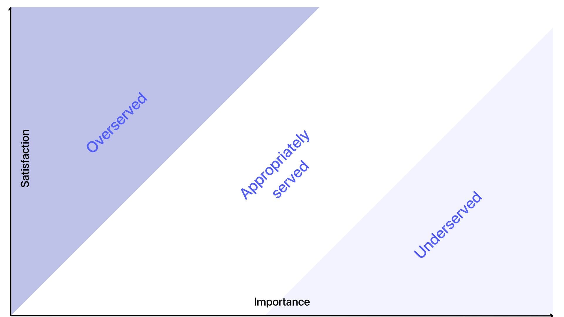
You can now rank different ideas or opportunities based on potential satisfaction and importance. To make it easier, you can plot the answers along the chart.
At this point, you should be able to see the features that matter the most to the customers but have low satisfaction scores within your product. This is a clear indicator to prioritize these features.
Pros: easy to visualize, categorize, and quickly identify innovative solutions
Cons: biased based on survey results
Best suited for: products with lots of potential features and a large and engaged existing customer base
Example
- Define opportunities
Identify a list of potential opportunities or features to evaluate and prioritize. For this example:
- Opportunity 1: improve search functionality
- Opportunity 2: enhance mobile app performance
- Opportunity 3: build a new integration
- Assign importance and satisfaction ratings
Rate each opportunity on a scale of 1-10
- Importance (or potential value of the opportunity)
- Satisfaction (current level of satisfaction or fulfillment of the opportunity)
Let’s assume the following ratings:
- Opportunity 1: Importance = 9, Satisfaction = 3
- Opportunity 2: Importance = 7, Satisfaction = 5
- Opportunity 3: Importance = 8, Satisfaction = 2
- Use the formula
- Opportunity 1: 9 + (9 – 3) = 15
- Opportunity 2: 7 + (7 – 5) = 9
- Opportunity 3: 8 + (8 – 2) = 14
- Prioritize opportunities based on the scores
- Opportunity 1 (15)
- Opportunity 3 (14)
- Opportunity 2 (9)
Product tree
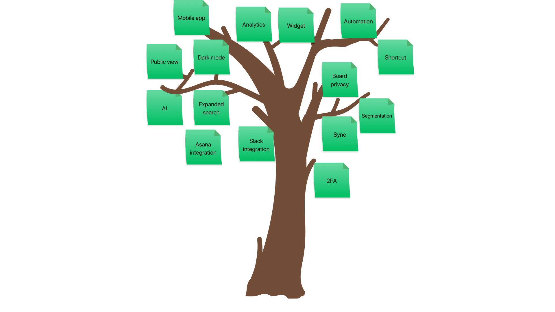
This is a highly visual way of prioritizing. The goal is to “prune” the tree. Here’s how.
- Draw a tree
- Add existing product features to the trunk of the tree
- Add coming soon features to the closest branches
- Add the rest of the ideas to the further branches
- Involve your team and customers; add their ideas as the leaves of the tree
Once you’re done, you’ll see which branches have the most ideas. This should give you a clearer direction as to where to take your product.
Pros: highly collaborative and visual
Cons: not quantitive
Best suited for: organizations with a large portfolio of products
Example
Buy a feature
This approach involves inviting your customers and other stakeholders to play a game. Here’s how it goes:
- Create a list of features you might want to build
- Assign a monetary value to each (based on effort, costs, time, etc)
- Get a group of people together and give each a set amount of “money” to spend
- Invite them to “buy” features and watch what happens
- Organize and prioritize your features based on which ones were purchased the most
Quick trick: purposefully place some features out of people’s price range. Encourage them to team up and put their funds together if they have to. If that happens, that’s an awesome indicator that a particular feature is super valuable and desirable.
Pros: fun and collaborative
Cons: won’t work for early-stage ideas
Best suited for: polished and ready-to-go features
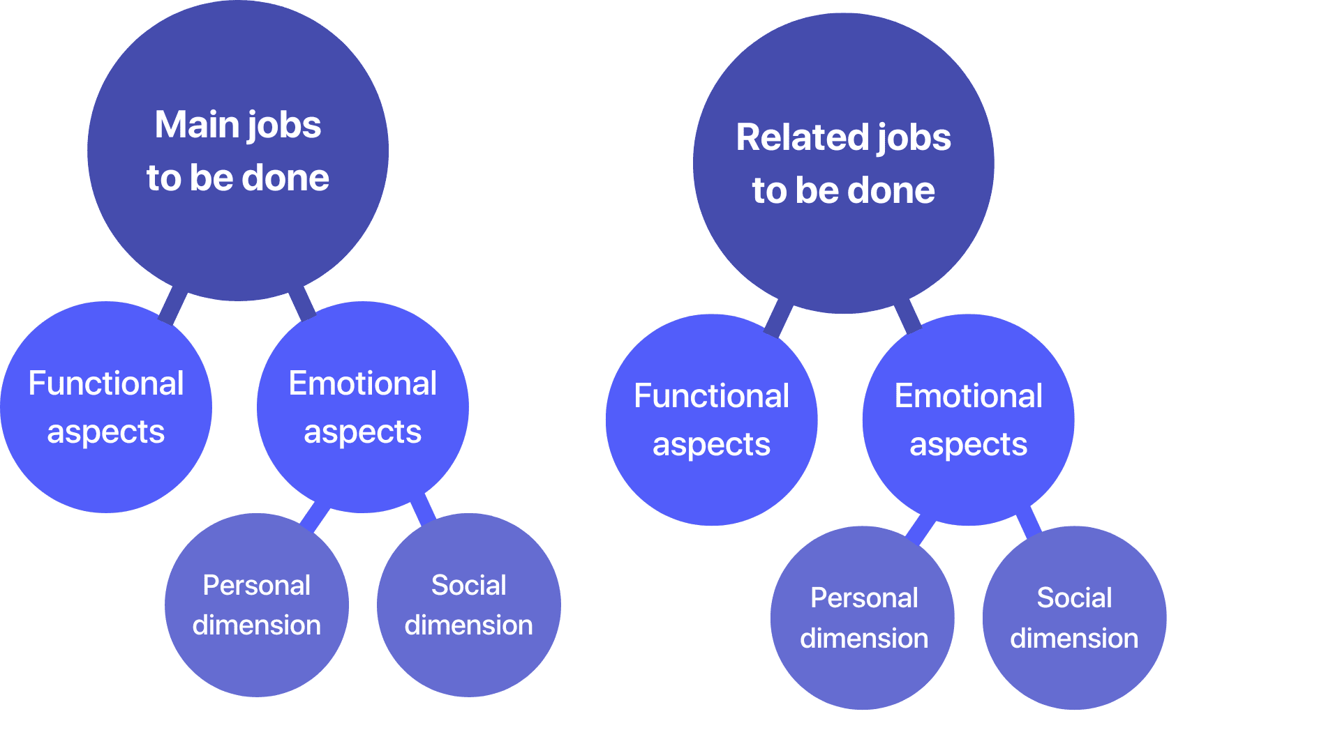
Jobs-to-be-done framework (JTBD)
This framework encourages product managers to take a step back and dig deeper into customers’ motivations. It originated from Anthony Ulwick’s opportunity scoring that we discussed above. And it’s a bit similar to user story mapping.
A common example is this:
- Someone says they need a drill
- You discover that they actually need to drill a hole in their wall
- As you keep digging, you realize that they want to hang a picture on their wall
- Now you can offer them alternative solutions (double-sided stickers, hooks, etc) and explain that they don’t actually need a drill
To use this framework, you need to develop a job statement. Here’s the formula:
[Verb] + [Object] + [Context]
Check out this episode of Lenny’s podcast featuring a co-creator of this framework (Bob Moesta).
Pros: provides a deep understanding of customers’ motivations and needs
Cons: might get too abstract and high-level
Best suited for: complex or high-involvement products
Example
If you’re building a fitness app, a job statement might be “improve physical health and get stronger”.
You’d collaborate with your team to define how your product can get that job done for a customer. You’d also list some desired outcomes for your customers. Then you’d assess potential importance and satisfaction and prioritize from there.
Priority poker
Here’s another collaborative and fun way of prioritizing feature requests. And here’s how you can use it.
- Shortlist some ideas
- Get some stakeholders together
- Give each of them 20 cards – 2 sets of numbers of 1 to 10
- Introduce the first idea
- Ask the team to lay down a card that represents how valuable this idea seems to them (1 = not valuable, 10 = very valuable)
- Reveal the cards and break people down into smaller groups; let them discuss
- Now ask them to lay down a card that represents estimation (1 = easy task, 10 = very difficult)
- Reveal the cards and break people down into smaller groups; let them discuss
- Add up valuation scores for each idea
- Add up estimation scores for each idea
- Divide the average valuation score by the estimation score
- Repeat for each idea
Pros: fun and interactive
Cons: time-consuming
Best suited for: products with a short list of ideas and lots of resources
KJ method
This method is also known as the sorting method, the matrix method, or the paired comparison method. Here’s how you can use it:
- Brainstorm a list of features
- Gather a few stakeholders
- Write each feature on a separate card or piece of paper
- Shuffle all the pieces of paper
- Ask each person to pick two random cards
- Now this person needs to pick one out of those two features and explain why they chose it
- Repeat
Pros: collaborative and fun
Cons: subjective as only one person makes the decision
Best suited for: products with a short list of already good ideas
Constraints framework
Many methods we’ve described share a similar drawback: they ignore the external environment. Lots of ideas can seem good on paper and rank very high when prioritized. But there are outside factors that can make building this feature very complicated.
That’s why the constraints framework (also known as theory of constraints) exists. It focuses specifically on constraints. Here’s how:
- Identify any constraints you currently face or may encounter in the future – time, budget, resources
- Rank them – either assign numbers to each, or use a weighted ranking system we discussed above
- Compare the constraints’ scores to the features you prioritized
Pros: includes the external environment
Cons: limited scope lack of precision
Best suited for: choosing the basic features for an MVP
How to choose a prioritization model
As you’ve read through these prioritization models, maybe some particular ones jumped out at you. If not, don’t worry – we’ll help you choose!
To select the right prioritization model or framework for your business, consider the following factors:
- The nature of the tasks you need to prioritize
- The goals you want to achieve through prioritization
- The resources and constraints you have available
- The team or individuals who will be involved in the prioritization process
- The level of complexity involved in your project or task
For example, if your number one goal this quarter is to retain current customers, maybe the Kano model is right for you. After all, it focuses on delighting existing customers.
Keep in mind: you don’t have to only to pick one. There are so many frameworks for a reason. And different projects, teams and timelines require a different approach. So keep this guide handy and refer back to it when you’re trying to prioritize new ideas.
You can also combine a few of these methods to find what works for you.
Prioritization in action: examples
Here’s how we prioritize at Canny. As we mentioned, we use the weighted scoring model.
First, we outlined the factors that matter to us:
- Votes from users
- Does this feature help to retain current customers?
- Does it help to generate new business?
- Is the idea coming from engaged companies?
- Is it a high priority?
- Is it ready for design?
- Will it help win new business for open opportunities?
- Is the vote coming from a paying customer?
- Does it improve our product roadmap?
- How does it affect our MRR?
- How many employees does this affect?
Here’s what it looks like.

As you can see, you can be as detailed or high-level as you’d like. Typically, companies start high level and then discover what they need to add along the way.
Gathering supporting data
Integrating with other tools makes prioritizing even easier. You know, the tools you already know and love:
- Project management tools: ClickUp, Jira, Monday
- CRMs: Hubspot, Salesforce
- Customer support tools: Intercom, Drift, Zendesk
You can also feed ideas and feedback from these tools to Canny – a user feedback and product management tool. That eliminates a lot of unnecessary work.
For example:
During a sales call, a prospect mentions a specific feature you don’t currently have.
Without leaving Hubspot or Salesforce, your sales rep can log in that feature request and make a note that this deal will help you win new business.
They can also note how much potential MRR this deal can bring.
This is exactly what we do at Canny.

When you’re ready to work on that feature, you can import all the info directly into your project management tool – ClickUp, Jira, Monday, or others.
Key to building a killer product
Product prioritization will help you truly delight your customers. When you prioritize the right projects, you’ll innovate, win new business, and retain existing clients.
There are many ways of prioritizing. You can certainly find a method that works for you. And don’t be afraid to try a few different ones. You’ll only know when you give it a try.
To make it all easier, try a product management tool. Canny will help you streamline all your feature requests and prioritization.
Give it a try for free and see how easy prioritization can be.


